Latest posts by Michael Gerber (see all)
- From Faith Current: “The Sacred Ordinary: St. Peter’s Church Hall” - May 1, 2023
- A brief (?) hiatus - April 22, 2023
- Something Happened - March 6, 2023
Star graphic designer Shepard Fairey (yes, you know him — think “OBEY” or that Obama poster) has created a new poster of George Harrison, to celebrate/promote the release of The Apple Years 1968-75. I think it’s pretty cool. What say you?
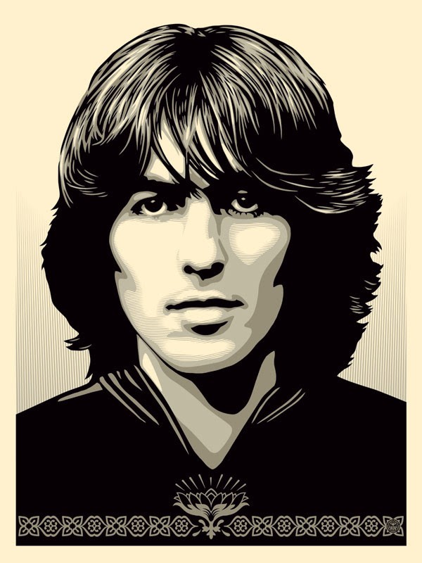
Please tell me he did this by hand and eye, and didn’t just apply a Photoshop filter. That MATTERS to me somehow
Interested in purchasing a Shepard Fairey George Harrison Poster for your own cozy little Beatle-infused digs? Be quick and vigilant:
“Silver edition to be released 24/10/14 through the George Harrison web store at 10am PST/6pm BST located here: www.georgeharrison.com (1 per household/person).”
Of course, it’s no Milton Glaser on Dylan…



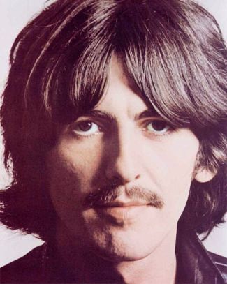


I have nothing against Fairey, but this is a really soulless “illustration”. Is it even an illustration? I’m honestly not sure. It conveys nothing to me. He could be a contemporary soccer player for all this tells me.
Nor I, @Eric, but I think I agree with you.
Ever seen any art that does what you wish the Fairey illustration did? Voorman’s Revolver cover, for sure, IMHO. I think the Avedon stuff is evocative and revealing, too.
Any illustrators that you think handled the Fabs particularly well? Alan Aldridge?
Definitely Voorman. No one else comes to mind! But that Fairey image is just cold, his line has no weight or humanity to it. It’s a boring composition, too.
@Eric, Voorman’s Revolver cover has always seemed to me to be the work of someone who knew them intimately as people, a psychological trove which no other illustrator had. Lennon’s a sly, angular cartoon; Harrison’s almost leonine and of the four is the only one staring at you; Starr’s all sensual curves; McCartney’s beautiful, but impassive and only showing you part of himself.
I guess my issue with Fairey’s art is that it’s pretty — decorative — but it doesn’t seem to have a strong point-of-view about George.